Chapter 6. Flowcharts
![]()
Flowcharts visualize a process, usually centered around a specific task or function. For web-based processes, flowcharts often represent a series of screens that collect and display information to the users. Also known as flows, user flows, process charts.
Flowcharts describe a conversation between users and the web site. The site asks for information, the user responds, and the site responds back. Users may express an interest in something they see, seeking to interact with it. Information and interest may be conveyed by any number of means—typing, uploading, clicking, dragging, speaking, hovering, gesturing, or any number of behaviors. Paths through web space must be planned, and flowcharts are the designer’s tool for defining those paths.
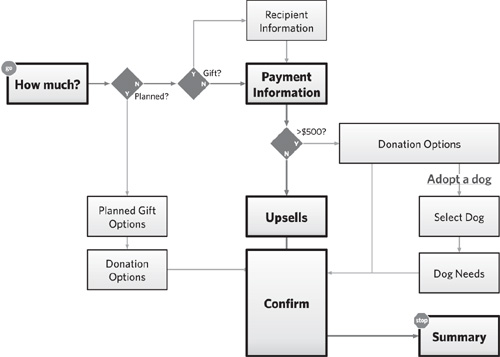
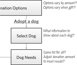
Figure 6.1. A simple flow. A little lean, but not a bad way to start.
Flowcharts must show progress and the give-and-take of information between users and the web site. They illustrate sequential relationships between steps in a process, leading to a particular outcome, like a checkout process or setting up an automatic payment. As the web becomes more sophisticated, supporting a broader range of tasks, activities, and processes, flowcharts must evolve to communicate the complexity.
Introducing Flowcharts
This is a pretty simple flowchart, but it demonstrates many of the basics. Note that, like a site map, it is a series of boxes connected by lines. This flow describes the process of making a donation to NEADS, an organization that trains assistance dogs for the deaf and disabled (see sidebar). To make a donation, users of this site must go through a series of steps, represented by the boxes. As they complete each step, they proceed to the next one, indicated by the line. Flows uniquely show forks in the path, usually driven by choices users made earlier in the process.
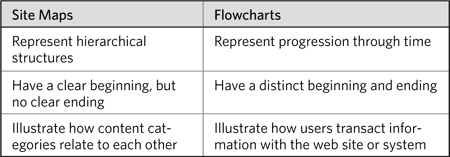
Stripped down, flowcharts look somewhat like site maps, don’t they? Boxes connected by lines. But there are crucial differences between these two artifacts:
Table 6.1. Contrasting site maps and flowcharts, some basic distinctions.
Challenges
In trying to capture the exchange of information between user and site, you will face some difficult challenges preparing flowcharts:
• Complexity: Designers who have worked on large enterprise applications know that any piece of information supplied by users can trigger multiple processes, algorithms, and responses. Flows are useful for thinking through this complexity, but you may struggle to show the depth of some processes. On the other hand, flows that successfully capture the complexity of an experience may be illegible, burdened with too much information.
• Completeness: No matter how elegant, a flow can never truly represent reality. Designers must always leave something out because they are tasked with abstracting and generalizing an elaborate dance between people and web sites. As much as we’d like every process to be executed the same way every time, this just doesn’t happen in the real world. Yet on most projects designers don’t have an opportunity to spell out every scenario and every nuance. Usually, the range of nuanced scenarios is so great that it would be impossible.
• Comprehensiveness: Web applications grow more sophisticated every day. The simple give-and-take, transactional approach is useful for describing flowcharts, but oversimplifies what the web can do. A truly comprehensive flow shows how people accomplish a particular task in many different scenarios.
With an awareness of these challenges, you are now prepared to confront them. In some ways these three things are limitations of flows: There’s only so much you can do in two dimensions. Flowcharts remain an effective tool for hashing out the transactional, interactive, and otherwise conversational aspects of user experiences. They open up a broader, more holistic view of the experience than individual screens can do. Yet they provide a more concrete representation of an experience than an abstract reference to “logging in” or “making a donation.”
Anatomy of a Flowchart
A user experience flowchart must tell a story with the user as protagonist, and therefore must include a beginning, middle, and end. The middle shows all the paths the user may travel before accomplishing the task and reaching the end.
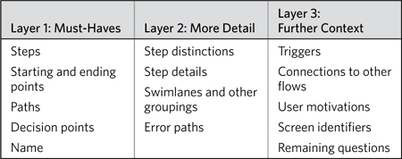
You might look at flowcharts, like all the diagrams in this book, as defined by three layers. The first layer includes all the essentials: Leaving one of these things out would likely change the diagram. Even the simplest flowcharts have everything in the first layer. The second and third layers contain additional information providing further detail and context. Whether to include them depends on your audience, your project, and your team.
Table 6.2. The elements that make up a flowchart, in three layers.
Layer 1: Must-Haves
Other diagrams in this book follow a similar node-and-link format: shapes connected by lines. Flowcharts, on the other hand, must also show progress, directionality, and usually some kind of logic to direct users along the appropriate pathways.
Steps
The basic unit of measure in a flow is the step, a discrete part of the process that takes users closer to the objective. They are typically represented as rectangles.
Figure 6.2. A step in a flow.
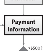
Steps, for the most part, come in two flavors: solicit and collect, and respond and instruct. Solicit and collect steps ask users for information. This may be explicit, such as requesting payment information for a donation, in which a user must enter a credit card number and other data. Less-explicit information collection would be tracking user behaviors or watching for specific gestures. Generally speaking, when the system receives the information requested, users move onto the next step.
Once users supply information, they generally expect some kind of response. Respond and instruct steps in the flow show the consequence of the system reacting to the information supplied: validating a credit card number, showing weather for a given postal code, displaying detailed information about a selected item. Variations of this kind of step include clarification (asking users to refine their input) and instruction (helping users understand what to do next).
A flow can consist of any combination of these kinds of steps, and it is in this combination that we see the conversation emerge, the give-and-take between user and system to move closer to an objective.
Steps are represented as a shape (rectangle) with a label. Good labels for steps summarize in a couple words the purpose of the step: shipping information, login, search results. If you struggle to label your steps, give yourself more than a couple words, at least to get you started. Also consider using a verb-object arrangement, like “Collect Recipient Information” or “Change Settings.”
Starting and ending points
A flow’s first and last steps are pretty important: They show where users enter and exit the process and, because of that, they distinguish flows from other node-and-link diagrams. A flow represents a process, a transaction, and a transition from one state to another. Going through a flow, users go from not owning a book to owning a book. The starting and stopping points represent the head and tail of that arc and should clearly communicate that state-change.
Figure 6.3 and 6.4. Starting points should be on the left side or at the top of the diagram.
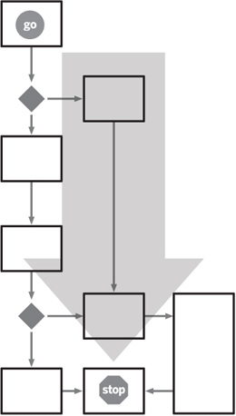
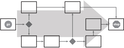
Position (where the box appears on the page) and labeling (what you call the box) can visually distinguish starting and stopping points from other steps in the process:
• Position: Legible flows read from top to bottom and/or left to right. Bonus points go to flows that read from upper left to lower right. This puts starting points toward the left or toward the top and ending points at the opposite end. Some flows need to represent a hub-and-spoke experience: Users start at a central screen and jump to different areas to complete different aspects of the objective. In this case, positioning that starting step in the center of the diagram makes sense.
• Labeling: I like to highlight the starting and ending points beyond just the layout. This helps people read the flow because they know exactly where to start. These visual distinctions, as they jump off the page, can also help readers gauge the depth of the flow. Seeing how many steps, paths, detours, and decisions there are between the beginning and the end can help set the tone for the flow’s complexity. Figure 6.1 shows how the starting and ending steps have been embellished with icons for Go and Stop. These are green and red, respectively, which you would have seen, but we wanted to save you a couple bucks buying this book.
Flows may have more than one starting and ending point. Flows that support multiple groups of users, for example, may have separate starting points for each. In these cases, the diagram must make clear in what circumstances a person would start at one point rather than another.
The only other case where you may need to embellish your starting points is when a flow is a smaller process inside a larger one. Like the geographical map that points to some other location off the page, the flow’s starting and ending points should indicate where users might have come from and where they will head next.
Paths
Most people are used to the convention of lines between shapes representing paths between steps. This common visualization says “Complete this step and move onto the next.” What can make it difficult to understand is the overall layout of the flow. Paths constrain the layout, limiting where you can put boxes in relation to each other. Some basic guidelines for assembling flows:
Don’t cross the streams: Paths that cross each other make the flow difficult to understand. Even if readers can parse your meaning, the overall impact of the flow is diminished when the basic story is not immediately clear. Instead, lay out your flow so that the paths don’t need to cross.
Limit embellishment: Paths should be lines with arrowheads to show directionality. You can use other techniques to imply progress: I’m a big fan of tapering lines.
You can vary line weight, color, or style, but simplicity is paramount. If you must, use no more than two or three different styles of paths. Two is appropriate for distinguishing between the main path and secondary paths through the flow. A third line style may be used to show other transactions happening in the background—for example, data being deposited into a database.
Emphasize main structure: The paths should be laid out to get readers to focus on the primary structure. That structure may be a set of steps followed linearly to complete a simple task, or it may be a central hub of three or four screens from which the rest of the flow branches off. Either way, arrange the paths so that these structures jump out at readers. In looking at flows, readers want to understand where people start and how the task is resolved, and the main structure is crucial for this understanding.
Orthogonal lines vs. straight lines: In flowcharts, use orthogonal lines. They imply pathway connections rather than structural connections. Two steps are connected in a flow because they follow a sequence, not because they are related to each other in any other way: orthogonal lines communicate the nature of that relationship well.
Orthogonal lines also allow you to arrange steps and other nodes in the flow on a grid, which makes it easier to follow.
Flows may be labeled to show conditions or highlight changes in state, but we’ll talk about these as part of layer 2.
Decision points
No process is free from conditions. Even the simplest processes require some “if…then” logic to determine which branch to follow. The sample flow tests for the condition, for example, of whether the donor is making a contribution on someone else’s behalf, as a gift.
Figure 6.6. Three line styles in this variation of the basic flow show different aspects of the experience. Lines with arrowheads show the main flow, while lighter-weight lines show alternate paths. Tapered lines show the flow of data to different steps from outside sources (represented by the cylinders).
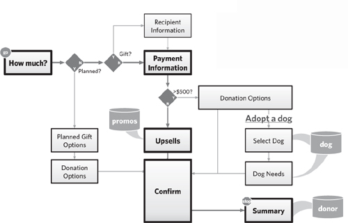
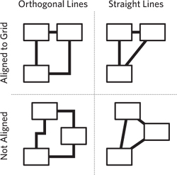
Figure 6.7. Connecting lines may be straight, with no angles, truly the shortest distance between the centers of the two shapes. They may be orthogonal, in which case they generally connect to a center point along one side of the shape. Shapes, for their part, may be aligned to a grid or not. This two-by-two shows all the variations.
These conditions are usually expressed as yes-no questions, like “Is the donation a gift?” The typical approach for representing a decision point, the diamond, is suited for branching flows based on the yes or no response.
Decision points don’t usually explicitly represent elements in the interface exposed to the user. That is, the diamond that says “Gift?” next to it doesn’t represent a dialog box in the interface that asks “Is your donation a gift on someone else’s behalf.” But decision points do describe conditions based on some user input. In the case of the sample flow, there is no indication of where users tell us whether the donation is a gift or not, but it is clear we need to collect that information somewhere.
Yes-no (or “binary”) conditions are useful for thinking through the potential branching in a flow, but may not be ideal for communicating the user experience in a holistic way. Your use of decision points should be based on the purpose of the flow and your target audience. If it makes sense to represent conditions in this explicit, binary way, however, consider a couple guidelines:
Stack ’em up: I like lining up the decision points so that the branching logic is all focused in one place. This makes the story more explicit and can help facilitate understanding.
Figure 6.8. A decision point, expressed as a yes-or-no question, with each possible answer leading to a different path.
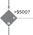
Figure 6.9. Stacking up the decision points in a revised version of the basic flow concentrates the logic in one area of the diagram.
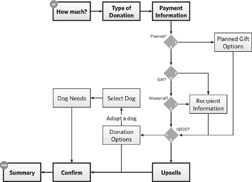
In this flow, we’ve addressed an additional requirement (letting users make a donation in memoriam) and recast the flow to line up all the decision points. The overall narration of the flow makes more sense: Determine type of flow, collect payment information, deal with potential exceptions, offer donation options, and then conclude.
Format decision points the same way: When you start playing with the decision points, you’ll realize that you can phrase them to control whether a yes response or a no response yields the exception. For example, the condition determining whether the donation is large enough for giving users donation options may be expressed as either “>$500” or “<$500.”
Throughout the flow, however, we have used yes responses to take users off the main process. Yes answers to “Gift?” and “Planned?” take users to additional screens to deal with those exceptions. Therefore, we formatted the “donation size” decision as “>$500,” for which a yes answer yielded additional screens.
Some decisions can’t be expressed in a word or two. Having the text of the decision float next to the diamond gives you room to articulate it however you see fit. Don’t even try to fit labels inside the diamonds, even with short questions. The “Y/N” text works nicely in there anyway.
Beyond binary: Most logic can be expressed as one or more yes or no questions. The traditional diamond shape representing a decision point, however, has three spare vertices, right?
Although you don’t need to take advantage of this, you don’t need to limit your flow’s logic to true/false. Decision points like this are relevant when:
• The flow is impacted by a simple selection: Users might select ground, two-day, or overnight shipping.
• The flow is impacted by three possible situations: Users might be logged in, not logged in, or recognized as previous users. (Web sites can use a cookie in the browser to capture whether users have been there before.)
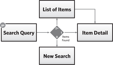
• The flow branches based on a quantity: A search mechanism might show different interfaces based on how many results are returned.
Figure 6.10. Rephrasing the decision point in this case has negligible impact on the readability of the flow, but watch for consistency and how the phrasing can affect the flow’s layout.
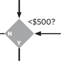
Figure 6.11. The diamond shape permits flexible layout and offers several possibilities for a logical structure beyond true/false.
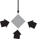
Figure 6.12. Presenting quantity-based options, this decision point escapes the constraints of binary yes-no logic.
Name
Finally, every flow should have a name. Names are crucial for every artifact—they give your readers a convenient way to refer to them. But a title for the flow should also summarize the objective described. To devise the name for the flow, try to answer the question, “What does this process let users accomplish?” Some good names include:
• New user registration
• Login
• Edit account preferences
• Make donation
Layer 2: More Details
With the basic flow laid out, the primary opportunity to provide more detail is in the steps themselves. While layer 1 focused on simple distinctions (primary path versus secondary paths), elements in layer 2 describe more nuanced distinctions and details for each step.
Distinguishing steps
In a one-layer flow, every node looks like a rectangle. You might vary the weight and value of the rectangle to get readers to focus on the primary path, but most processes may be conveyed with this level of simplicity. You can amp up the distinctions if you find yourself dealing with multiple participants or processes that cross into different media. Flows can include external systems or make outcomes and milestones more explicit.
Wireframe
A sketch of a screen, showing its contents and structure, but lacking aesthetics or accurate layout. More on these in Chapter 7.
Figure 6.13. Some steps are more important than others, and this hierarchy should be reflected visually. Why? In this case the Payment Information screen is one everyone sees, whereas users see the Recipient Information screen only when they select the gift option.
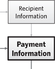
In all these cases, such conceptual distinctions require nothing more than simple visual distinctions.
Though flows are generally a series of steps to help users complete a task, there may be an implicit hierarchy in the steps. Changing the line-weight or color and shading of the rectangle, or the typography of its label, can help communicate this hierarchy. Such distinctions may be important to help your audience understand how to read the flow: where to focus their attention first. Here are some reasons you might distinguish steps:
• Some steps are more important, perhaps because they serve as a primary jumping-off point for several different flows.
• A flow may consist of one primary pathway and several secondary pathways.
• The flow may have required steps and optional steps.
Step details
Another natural evolution in your flowchart will be exploring what goes into each step. In elaborating on these details, you can liberate yourself from the tiny square to a larger area, in which to include various screen elements. There are four ways to provide further detail:
Functional notes: Before digging deeply into the details of each screen, I generally include some notes adjacent to the more important steps. These notes clarify the flow by offering insight on the things users will do in each step.
Notes should be brief, unstructured, and focused on describing behaviors and screen content that moves users through the flow.
Full screens: At the other extreme, you might dump a full screen rendering in the flow. There are various reasons why you might have full screen renderings on-hand:
• You’ve done some design work and are now stepping back to paint context.
• You’re creating a flow of a competitive product.
So, if you’ve got screens, use ’em. These hybrid documents are sometimes called wireflows, combinations of wireframes and flowcharts. The utility of a wireflow over each of its genetic parents is indisputable: They solve deficiencies in each of the source documents.
Partial screens: Somewhere in between (but closer to “full screens”) is to include crucial screen elements in each of the steps, but not in any particular layout. The rectangles contain a handful of fields or content elements, meant only to evoke the conversation between user and web site.
Figure 6.14. Oh, man! Someone wrote all over this flow. Darn handwriting typefaces.
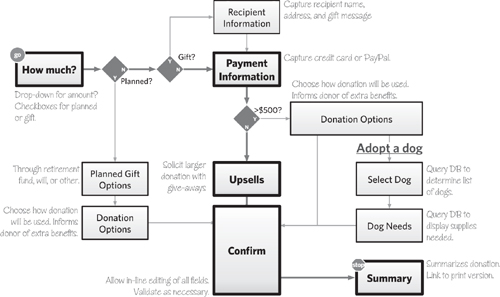
With this approach, the way to determine whether an element is important is whether it has an impact on the procession of the flow. For example, most of my partial screen flows sometimes do not include a submit button on the forms. Such an interaction is self-evident and doesn’t contribute to the broad story.
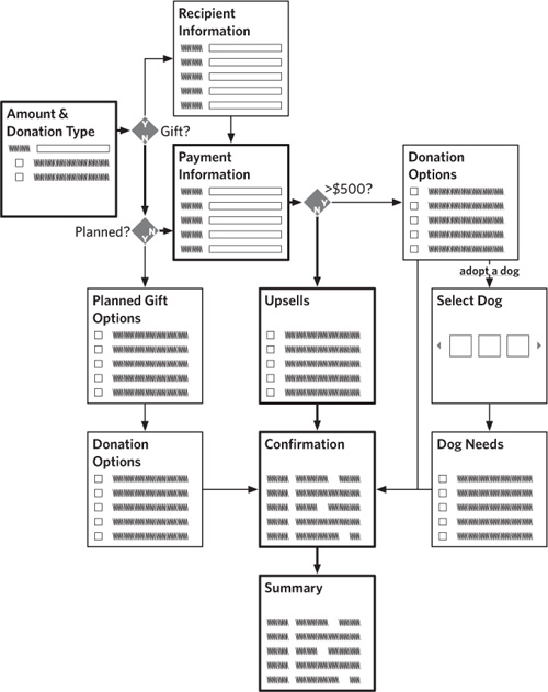
Sketches or thumbnails: Another option is more abstract. In this approach screen elements aren’t stated explicitly, but evoked through the use of geometry and labeling.
Again, circumstances driving the decision to use this approach may vary. It’s useful, for example, if you’re working with a preexisting design system and you can use these thumbnails to refer to well-understood page templates.
I once used thumbnails in a flow after I had already done some wireframing. In the situation, it wasn’t necessary to show the detailed functionality of each screen, but I did want to show how all the screens stitched together in various usage scenarios. The design team had been looking at wireframes for weeks, and a simple thumbnail was all they needed to recall the screens.
Figure 6.15. Wireflows, the terrifyingly beautiful love-child of flowcharts and wireframes, with partial screens. Each step in the flow shows only the essential elements of the screen.
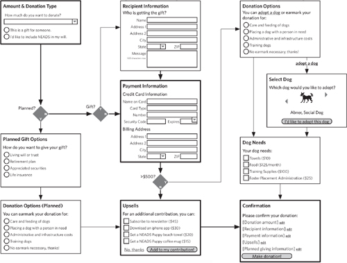
Figure 6.16. Using thumbnails instead of partial or full screens, this wire-flow evokes the structure and purpose of each page through symbolism rather than through actual content.
Path details
Paths do not afford as much opportunity to express details. Embellishing the lines too much can make the drawing difficult to understand. Also, with enough detail on a path, might as well make it another step, right? Still, there are two reasons I might add further detail to a path.
Triggers: A flow may branch based on a simple user action, like clicking a link. This branching is less about business rules and more about users making an explicit choice. In these cases, a typical decision point is overkill. “Did user click ‘add options link’?” makes perfect sense, but it is excessive for capturing the spirit of the interaction and may even bury the intent. You can label the line with text, formatted to look like a link, that shows what users need to click to trigger that path.
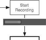
State changes: Sometimes steps have secondary consequences. Following a certain path may, for example, cause a cookie to be set in the user’s browser. It may activate a particular indicator or change the status of a flag. All these secondary consequences are like mini-steps, but may be owned by someone (or something) other than the user. The purpose of the flow may not warrant a more in-depth visualization to capture these changes. (Designers who do require such detail in their flow might consider swimlanes, a technique discussed in the next section.)
Figure 6.17. Text formatted as a link or button on the path itself can clearly indicate how users get to this part of the flow.
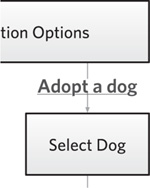
Figure 6.18. State change. OK, this isn’t the donation flow any more. This is an excerpt from a flow describing the process for programming a DVR. It shows that when the DVR starts recording, an indicator light appears on the face of the physical device. The interface of the box goes through a state change.
Swimlanes and other groupings
Another way to elaborate on steps is to group them together. Steps may be grouped because they are performed by the same person. Perhaps a group of screens collectively represents a particular stage of the process—“macrosteps,” as it were. The groupings may be more subtle: A screen may look different in different circumstances, and the group represents all the different “views” of the screen. I’ve used three different techniques for grouping screens:
Swimlanes: The elegance of swimlanes makes them an excellent tool for communicating the multiple roles involved in a process. Swimlanes form a backdrop for the flow as either broad rows or columns, with each row or column assigned to a different participant. Steps appear in the row or column of the participant who performs them. As paths cross into different lanes, the picture shows how several people work together to achieve the process’s objective.
You can dedicate a column to the web site itself, showing tasks the system must perform in response to user actions. Until now, the “steps” reflect screens—or portions of screens—users interact with. Swimlanes afford designers the opportunity to make explicit online and offline processes.
Ultimately, however, the value of a swimlane diagram is to show how different people operate together. Frankly, I find them most valuable when trying to describe a business process (or how an existing process will benefit from a new participant: the web site). Typically, those processes come after users have interacted with the system in some way—how an order is fulfilled, for example.
Imagine NEADS creates a site that consolidates all the contributions people can make in one place. Users can donate money, time, or supplies all through one convenient form. (More on this later in the chapter.) This swimlane diagram shows what happens after a user has submitted a donation. Three different groups within NEADS would have to get involved:
Figure 6.19. Using swimlanes, this flow speculates about what happens when a donation is submitted to NEADS. It shows the business processes and the various parts of the organization involved.
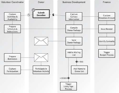
• Volunteer coordination, to deal with someone who wants to donate time
• Finance, to capture monetary donations
• Business development, which serves as “donation central,” processing everything that comes in
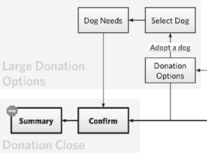
Background fields: You can create backdrops for the steps in your flow, putting simple fields of color behind them to communicate a logical grouping. This approach is more appropriate for indicating that the collection of steps is related functionally in some way.
The donation flow, for example, might create four groups:
• Basic donation information
• Donation exceptions
• Donation options
• Finalization
It’s worthwhile to create these groups if there’s a need to speak of the flow in terms of these broader “macrosteps.” Each macrostep might be documented separately, such that the main flow shows the overview, and a second, separate flow explores the details.
Figure 6.20. By labeling groups of steps in the donation flow, designers and team members have a way of referring to its four “macrosteps.”
Styling the steps: Color and other style elements offer one approach to communicating logical groupings of screens. With a quick glance at a flow where boxes are color-coded, readers will immediately understand that similarly styled boxes are related to each other in some way. Color-coding can be challenging because the nature of those groups may not be readily apparent.
Typically, I use this approach when the differentiation between the steps is not essential to understanding the user’s experience, but is useful from other perspectives, like:
• Implementation perspective: Some screens exist and need no modifications, some need extensive modifications, and some are new.
• Slightly different implementation perspective: Some screens use templates from the content management system and others do not.
• Development perspective: I want to strongly differentiate screens that appear in response to an error.
• Architectural perspective: There are two environments, and screens appear in one or the other—like before and after the user logs in.
• Strategic perspective: Some screens offer greater opportunities for selling ad space.
• Usability perspective: Screens throughout the flow may fall into different categories based on their objective or purpose.
Error scenarios
Error scenarios describe what happens to users when they do something that prevents them from completing the process. Perhaps they forget to enter information in a required field, for example, or they supply inconsistent information. You can document these on the main flow, showing what screens go through a validation process and the kinds of errors that might be caught. Error validation beyond simple field-level checks might warrant detailed flows of their own.
Flowcharts should visually distinguish between branching—taking users down different roads depending on the choices they make—and errors, which temporarily abort the flow. The kinds of decisions inherent in an error scenario may not need spelling out. In this sample flow, the validation routines are represented by a box and the possible errors as separate rectangles within it.
Figure 6.21. Validation errors, incorporated into this version of the flow, capture mistakes users might make during the course of completing the process.
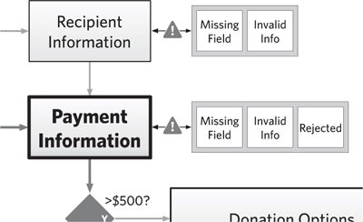
Figure 6.22. Establishing the overall flow at the beginning of the document allows you to set context. As you elaborate each step in the high-level flow with a more detailed diagram, incorporate a small version of the high-level flow to highlight where you are.

Figure 6.23. A quote from each relevant persona is the least you can do to ground your flowcharts. Make the characters’ reactions honest but meaningful relative to their relationship to the flow. “I can’t figure this out,” isn’t helpful. But, “I’ve donated to other organizations, and this process is confusing,” is better.

Layer 3: Further Context
Your flow may contain an additional layer of information, showing how this user experience connects to other aspects of your project. Flows that are small segments of a larger experience or the output of substantive user research or the lead-in to a wireframing exercise all need connections to those documents.
Connections to other flows
The best way to simplify a complex flow is to break it down into smaller pieces. The “big” flow shows high-level steps. Each step should refer to a more detailed flow.
The detailed flow must show what came before and what comes after, putting more burden on the start and end points to communicate this additional context. Further, a mini version of the comprehensive flow, adjacent to the diagram showing the detailed process, helps set context.
User motivations
Nothing brings a flow to life more than injecting some insights from user research. The more you know about the people who will actually experience the flow, the more you can describe it in the context of usage.
You can express motivation on several levels, but with a complex flow it may be easiest to focus on the highest levels. Employ quotes (hopefully real, but fictitious with justification works, too) at the beginning of the flow to show why users might trigger it. A choice quote can help establish context and set readers’ frame of mind when reviewing the flow.
Screen identifiers
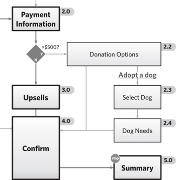
If the steps in your flow correspond directly to wireframes, you can bridge the gap between them by assigning identifying codes—combinations of letters and numbers that uniquely identify the screen. By using these same codes on the pages of your document to describe the wireframes, readers will feel like all is right with the world.
Such universal harmony can come back and bite you on your karmic butt if any of the screens change. Add and remove steps here and there and your whole numbering scheme can be thrown off. You and your soul were warned.
Figure 6.24. A code identifying each screen appears adjacent to each step in the flow. These handy codes will let you refer to the screens in other artifacts.
Remaining questions
If you intend to solicit further discussion about the process the flowchart represents, you can embed questions about the flow in the document itself.
The flow might be, out of necessity, incomplete. It may include speculative decisions about the process, serving as a “strawman” to stimulate discussion. (Note design has perverted the definition of strawman. Normally, such an argument is a restatement of someone’s position in such a way as to make it seem weaker.) Such an approach easily sets the agenda for conversations with stakeholders.
Figure 6.25. My job is really about asking questions. Asking the right questions of the right people can yield a wealth of information. Asking questions about specific design concepts can be even more powerful. Since design diagrams are meant to facilitate conversation, you might as well embed your questions right into the document.
Creating Flowcharts
When you are sitting down to begin a flowchart, where do you begin? You face some initial decisions about the content and format of your flow.
Basic Decisions for Flowcharts
The elements of a flow are pretty straightforward. Their simplicity and pre-existing conventions make them easy to understand yet offer a lot of flexibility in the overall presentation. Like any diagram, flows present countless opportunities to do too much—try to tell too big a story, show scenarios for too many users, or describe multiple levels of abstraction. Purpose, audience, and content all help keep flows focused.
What is the purpose?
A flow’s purpose is not the task or user objective it shows. Sure, the purpose of a flow is to communicate such a story, but the role of the diagram in the project should drive its composition. Like any deliverable, a flowchart must in some way contribute to the progress of the project. If you can’t describe how the flow moves the project forward, you probably shouldn’t be doing the flow.
Like the other visualizations described in this book, flows have two primary purposes (see Table 6.3):
Table 6.3. Zeroing in on a more specific purpose for your flowchart. Many of these purposes are similar to other design documents.
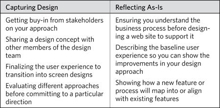
• Capturing design decisions: Flows can represent how a site will behave. That is, it can show the outcome of a creative process—one that sought to establish the best possible approach for supporting a particular task or set of tasks. In this case, the flow might go through multiple revisions as you refine the approach, clarify the design problem, and incorporate new ideas. At the tail end of such a process, the flow will provide context for subsequent design work.
• Reflecting as-is understanding: Flows might also be useful for describing how the site behaves currently. As such, this visualization can facilitate conversations about what it’s not doing today that it needs to be doing. In short, flows describing as-is processes are tools for learning more about the design problem. In this case, the flow may take a broader view, describing not the site’s current user experience, but the current business process that a new site must support. Describing a business process is another way of stating the design problem.
The purpose of creating the flow may be more specific.
Use your purpose to drive the decisions about the content and format of your flow. Every flow must have layer 1 elements, but elements on layers 2 and 3 are optional, and should be supported by how you intend to use the flow. You should be able to draw a clear connection between the content in your flow and the flow’s purpose. More details on the content decisions you should make in creating a flow appear in the upcoming section, “What does it show?”
How does it fit into the process?
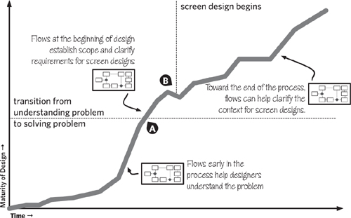
With respect to methodology, the key decision for a flow is whether it comes before or after screen designs. For the most part, you’ll do a flowchart before you design screens: They provide an easy way to work out the overall structure and make it readily apparent what screens you need to design.
Project plans should allow for sufficient time to revise the flowchart. The mere act of documenting a process on paper (and showing it to others) can trigger new ideas of what the process should be. Even after you begin designing screens, you’ll likely revisit your flow, adjusting the approach based on information that surfaced throughout the design process.
There are circumstances when you’ll create a flowchart even long after you’ve been working on screen designs. In this case, the flow provides context after the fact. The flow isn’t describing anything new—with the screens designed, the overall experience is already in place—but instead it’s helping to explain it. This can help the people reviewing your screens understand how they all fit together.
Figure 6.26. Your design efforts will make two key transitions. At (a) the design team switches from “understanding the problem” to “solving the problem.” At (b) the design team switches from sketching out high-level concepts to digging into the weeds. Flows can play an important role before, during, or after either of these transitions.
Who is the audience?
Second only to purpose, the target audience for a flowchart drives its content and composition. Really, purpose and audience work together to influence the approach. Generally speaking, with respect to flows, different audiences have different priorities:
Table 6.4. Different audiences have different priorities. This is what makes them different audiences, right?

The challenge will be dealing with multiple audiences. When there’s no clear priority, I always focus on the developers. Get the logic and structure right, and the rest will follow.
What does it show?
The layer descriptions described earlier provide a detailed account of the kinds of information you might include in the flow. Steps, decision points, paths, and other elements represent a template, a collection of Lego bricks you can use to construct your flowcharts. There are less tangible decisions you need to make, too:
• Scope: A broad scope shows an end-to-end process, not just making the coffee but everything from growing the beans, to transporting them, to roasting them, to selling them. A narrow scope shows a thinner slice of the process. Your scope may already be defined based on the need.
• Abstraction: Even with the scope defined, you can talk about the steps in the process at varying levels of abstraction. In this case, abstraction represents the distance from tangible reality. It’s the difference between describing people’s thought processes for making donations and the actual screens they see and buttons they push. Early in the design project, you will create more abstract flows to help you understand the process the web site will support. As the project progresses, your flows will become more concrete as you focus more on the specific screens and interactions.
• Detail: How much can you say about each step? Highly detailed steps are explicit about the kind of information collected or the kinds of tools used (in the case of a business process). Highly detailed steps can identify the exact information to be displayed back to the user. A flow’s purpose should identify how much detail is required, implying, for example, how much you need to say about a step in order to meet the need.
With these decisions nailed down, the purpose defined, and the audience identified, you can make a list of the things you want to show in your flow. Sure, you’re going to describe a process through steps, paths, and decision points, but every diagram is more interesting when it shows a contrast, when it tells a story with multiple layers. Will you show how different users use the flow differently? Will you show how the new user experience will seamlessly integrate multiple legacy systems? Will you draw a parallel between an online and an offline experience? Use this list to help plan your flow. Sketching some ideas first, you can see how you might wrap in some of your other elements. You can also prioritize your messages to avoid overburdening the visualization with communicating too much.
There are countless opportunities to say something more, but the best stories are meaningful because they reflect the context in which they’re told.
How is it structured?
Designing the flow itself is beyond the scope of this book—the structure, pace, and sequence of your flow are up to you and the subjects of many books, articles, and workshops on interaction design. Caveat out of the way, two structures seem common enough to warrant further elaboration. These structures are patterns, really—typical approaches that provide reasonable starting points for thinking through a process.
In the words of Morpheus, this is going to feel a little weird.
Exclusive flow: In this kind of flow, users face one or more gates where each option takes them on a specific path. It’s called exclusive because the paths are separate from each other: Taking the red pill means not taking the blue pill.
Visually, exclusive flows will have one or more decision points linked together to identify the appropriate path. In the illustration, there is a separate path for each kind of donation: gift, planned, in memoriam. What’s distinctive is that each path ends at the same place, the next step in the process.
How do you know if you’ve got an exclusive process? If you can describe it as “users can do A or B, but not both,” that’s an exclusive path.
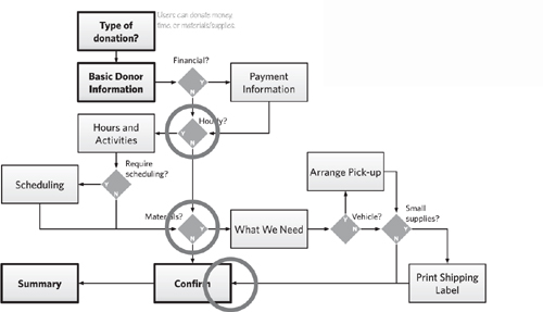
Inclusive flow: The other kind of flow is where users can select multiple options, and they’ll follow the paths for all the options selected. It is inclusive, because it’s possible for users to select all the paths. Figure 6.29 is an example.
Figure 6.29 describes a new experience for donating to NEADS. Users can elect to donate money, time, and/or supplies. Because they can do one, two, or all three of these things, the paths connect up to the next decision point. Selecting a financial donation does not preclude me from selecting a volunteer activity.
You’re now leaving the Land of Logic—population, your headache. As visual thinkers, we might find it frustrating to delve into this kind of mind-numbing work of ORs and ANDs. Design, however, thrives on patterns, simple recipes for thinking through a design problem and providing a starting point for new approaches.
Figure 6.28. All branches lead to the same destination in an exclusive flow. Compare to an inclusive flow, where the decision points all lead into each other.
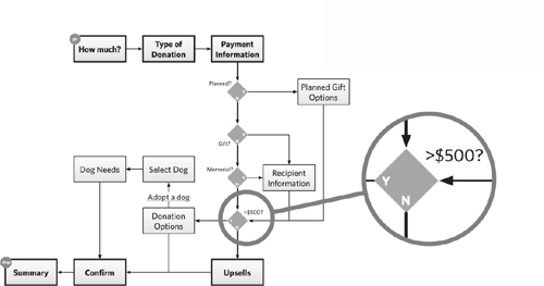
Figure 6.29. An inclusive flow means that users can experience every option depending on the choices they make. The highlights show that each subflow terminates in the next decision point.
Tips for Fantastic Flowcharts
Having established the overall context—what for, for whom, and what to say—you can do several things to make sure your flows are easy to build and to understand.
Start with crucial landmarks
Every flow starts with a handful of boxes connected with lines. Do this with pen and paper to lay the groundwork, and let the flow start to take shape in your head. Crucial landmarks are the primary steps or screens in the process. This initial cut for me is always a series of half a dozen boxes running vertically or horizontally. Sketching these out first, I’ll do subsequent passes on the flow, annotating the boxes or throwing in smaller boxes on either side.
Figure 6.30. All my flows start like this. Just be sure to label everything. You don’t want to come back to it later and forget what you were thinking. Sometimes I get so intrigued by a layout or approach I forget to label things, opening myself up to some cheeky remarks about the state of my neurons.
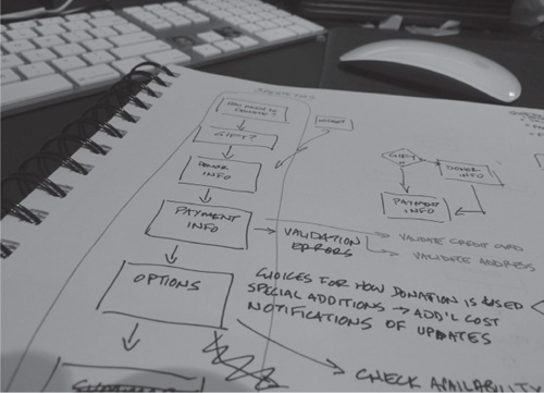
Figure 6.31. Nascent flow. When I bring the flow into a diagramming application, I start simple.

At some point, that first sketch becomes too difficult to read, it’s got so much going on. Further iterations elaborate the flow, inserting the new steps and decision points. The shape of the flow is not yet formed in these early stages. Your aim at this point is to get all the information down on paper: What are all the steps and decisions in this process?
Keep the layout simple
Transfer your sketches to your preferred illustration or diagramming application. Lay the steps and decision points out on a grid. This will make it easier to follow the logic and insert backdrops for grouping steps together.
Identify a visual language
Establish a consistent set of shapes and graphic conventions to use in your diagrams. Even if the subtlety of their meaning is lost on your readers, the consistency will facilitate understanding.
Fortunately, flowcharts have been around for a long time, and come with established conventions. Many people are familiar with these conventions, and they are as reasonable a starting point as any for constructing a flow. The simple geometry offers lots of opportunity to embellish the conventions, injecting your own style and meeting the needs of your diagram.
A visual language implies a grammar, a predictable set of rules to help people interpret your diagrams. The visual nuances identified earlier—line weight, color, shading, value, and typography—are powerful differentiators. Apply them in ways that illuminate the important distinctions in your flow:
• Primary path vs. secondary paths
• Standard steps vs. steps in error scenarios
• Existing screens vs. new screens
• User 1 vs. user 2
• User task vs. system task
Know what distinctions you want to make before defining your visual language and assign these graphical variations after you’ve identified them.
Simplify complex flows
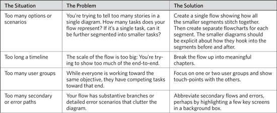
Complexity comes from trying to do too much. When your flow starts to lose cohesion and when people don’t “get it” just by looking at it, you need to simplify. First, however, you need to diagnose what’s wrong (see Table 6.5).
Table 6.5. Hardly a comprehensive list of all the things that can go wrong with a flow, but a good place to start.
Perhaps the best way to simplify a flow is to eliminate explicit decision points. Stop your sputtering. Not 10 pages ago, I was telling you that decision points were essential to a flow. Note that I said “explicit” decision points. There are ways to communicate the logic of a flow without a little diamond.
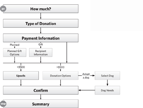
Here is that “exclusive” flow a bit tidied up. What I did:
• The flow now consists of a single stack of steps, which makes the process easier to follow.
• Decisions are not represented by explicit and discrete nodes, eliminating visual elements that might distract from understanding the story.
I had to cheat one thing. Note the thick black line in the middle of the flow. This is to account for two decisions that happen back-to-back: what kind of donation and the amount of the donation. With no intermediate step between them, I need a way to show that these decisions happen sequentially. This technique is actually something used in Activity Diagrams in Unified Modeling Language (UML), a collection of diagrams describing software engineering designs. In that convention, though, this technique (called a “fork”) implies two paths running concurrently.
Figure 6.32. Eliminating decision points tidies up the flow, but buries logic, which may not be appropriate depending on the circumstance, purpose, or target audience.
Build frameworks
Web sites are looking and behaving less like a sequence of pages and more like applications you’d find on your desktop. Through this maturity, we find that typical point-A-to-point-B flows are insufficient for representing the range of features in our web applications. The screens making up our web applications can support more than one scenario at a time. A framework, therefore, is a network of screens that permit users to accomplish multiple tasks, or one task within the context of many scenarios.
Figure 6.33. A framework doesn’t prescribe a particular starting point or ending point necessarily, but there remains a sense of progression. The relationships between the nodes aren’t hierarchical in the sense of belonging. A screen that points to another screen isn’t a larger category as it might be in a site map.
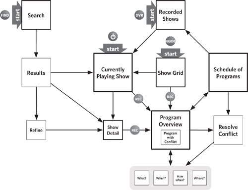
With this approach, your flow might look more like a site map—a set of connected screens. What makes it more flowlike, in my mind, is:
• It represents a change of state (such as the transaction of a donation).
• It has a starting point and an ending point, though the framework may capture multiple starting and ending points.
• Its connections represent a progression through time, not through a hierarchy, taxonomy, or other series of categories.
The donation flow isn’t a good example for a framework. Though users may all have the same larger objective (helping the organization), the nuances in the flow are driven entirely by the user. Compare that to, for example, programming a DVR to record a television show. Although users control many of the settings, there are several other variables that can affect how they accomplish the task:
• Where and how they trigger the recording
• What else they have scheduled to record
• The nature of the show they want to record
Generalizing about this flow, processes that might lend themselves to a framework exhibit many of the same properties.
Table 6.6. A “framework” is a specialized kind of flow that works well for some processes. A framework relaxes some of the constraints of a flow. This table describes characteristics of a process that are better represented as a framework.
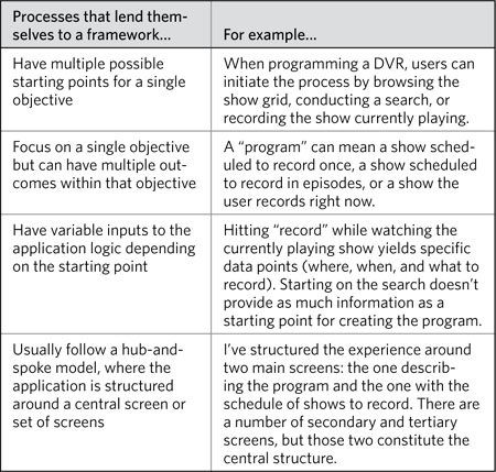
Telling the story with a framework can be complicated. You need to be able to show how the framework successfully supports all the possible scenarios. For most applications, this is impossible; no amount of research will be able to anticipate all the different situations the application will need to support. That said, research and stakeholder knowledge will be able to anticipate several crucial or frequent scenarios, and these are the ones you should show.
Level-Up Your Flowcharting Skills
Despite all your planning, you may still run into a few problems as you develop your flowchart. Here are some ideas about how to deal with them when they come up.
Capture all the details
The experience you are designing has a long way to go before it becomes a real web site. There will be, in other words, ample opportunity throughout your process to capture details that you miss at this stage. Still, wouldn’t it be nice to know that you’ve identified the majority of little details that crop up?
Remember when you first conceived the flow? The whole thing didn’t just pop into your head, ironed out and done. It was a gradual process, starting from a loose series of boxes that you elaborated over time. That elaboration included:
• Additional steps to capture additional information from users
• Single steps that you broke up into two or more steps
• Additional logic
• Branches to deal with unusual exceptions
• Branches to deal with users making errors
• Branches to deal with new features, introduced by stakeholders who forgot about them until they saw the first version of your flow
• Background system responses based on user input
• Sourcing the data
• Branches to deal with additional types of users
• And so much more.
Remember all those things? Right, so when you’re looking for details, these are the kinds of things you’re looking for. A couple techniques to help:
• Get someone else to look at the flow: Walk another designer through the diagram. Another pair of eyes may identify things you missed. More importantly, the act of narrating the flow to another person inevitably raises issues you hadn’t thought about. The bonus is the new perspective your colleague brings. Bringing her experiences to bear on your work can raise issues you never thought about, and the ensuing dialog (always get her to clarify her feedback!) can also expose hidden issues.
• Try to design the flow differently: For almost every project I do, in the early stages I force myself to imagine a different approach. If I’ve zeroed-in on a linear flow, I force myself to imagine it using a hub-and-spoke model. If I’ve decided that users should complete the flow in a specific order, I try to create a flow in a different order. This pushes me to consider the flow from a new perspective and ask myself a new set of questions: Are these fields in the right place? Am I requesting the right information from users? Are there other errors they can commit here? The new perspective can help you ensure that you’ve addressed all the details on your original flow.
Express reality
Flows have a tendency to smooth over the natural variations between circumstances, giving the impression that every user will go through the same experience. Getting caught up in the details of the flow, you might start to see your users as automated repositories of information who simply spit out data when it’s requested, rather than individuals who bring unique scenarios along with them. A few mitigation strategies:
• Tie the flow to requirements: Presuming that your flowchart is an incremental step in the design process after gathering requirements, you can make sure the flow addresses every requirement. While not perfect, such an approach does at least ensure you’re internally consistent.
Figure 6.34. Replacement references — in this excerpt, requirements references (represented by the numbers) appear adjacent to the groups of steps. Apparently, the “Donation Close” macrostep addresses requirements 2.0 and 3.1.
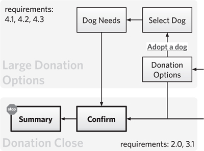
• Embed personas in the flow: Putting users in the flow itself forces you to put yourself in their shoes. Represent them by including their avatars in the margin with some account of how well their needs are met by the flow. Alternatively, you can put small avatars next to steps or other parts of the flow, as in the illustration, to indicate whose needs they address.
• Move on: Don’t get to the point where you’re fretting about a flowchart. In most cases, the flow isn’t the destination: it’s a starting point. Use it to set the direction and frame up your initial ideas about the interaction, nothing more. Design is a process of continual refinement. Designers must use and discard tools like flows (and the other diagrams in this book), getting from them what’s needed without expecting much more.
Figure 6.35. Steps in the flow are geared toward the needs of specific personas. Each persona is represented by a different shade of avatar.
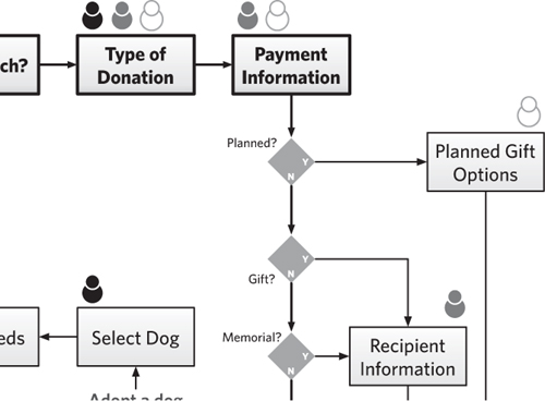
Keep the document up to date
Flowcharts are hard to keep up to date because in the natural evolution of a design, they may be quickly left in the dust. Before worrying about how you’ll keep your flowchart up to date, decide whether it’s essential to do so. If you’re using a flowchart to kick-start the design process, but not necessarily as system documentation, you may decide that going back and keeping it up to date after changing the flow may not be worthwhile.
Flowcharts that become part of system documentation (and there are still a few of us who need to do this) should be updated to reflect the most up-to-date experience in production. A couple of thoughts:
• Keep it simple: Highly elaborate flows are harder to update. You may be proud of how you layered in user needs with database calls and business rationale, but those details are not essential to system documentation. By all means, at the beginning of the project, tell the whole story. But keep a copy of the simple version of the flow, so you can work updates into that diagram.
• Preserve the original: The system documentation should include both the most up-to-date version and the original version of the diagram. Compromise happens, especially during the course of a technology project. The original may reflect a desired state while the design in production is a collection of compromises diminishing the user experience from the ideal.
Presenting Flowcharts
Presenting flowcharts to team members and other project participants can be challenging because although they represent something concrete—the interaction between system and user—they do so in an abstract way. Your flow may not contain details like screen elements because you are focused on designing the interaction before the interface. At the same time, it’s much easier to talk about the user experience with an interface in front of you; people tend to provide better feedback on a wireframe or screen design. Building on the presentation framework from Diagram Basics (Chapter 2), you can adapt your meeting structure using the tips below.
Table 6.7. Choosing the right type of meeting for reviewing your flow.
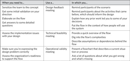
Establish a Purpose for the Meeting
There are three main reasons to discuss flows: to evaluate the design of the user experience itself, to assess the experience in terms of technical feasibility, and to see if the organization can support the experience. In all three cases, you’re trying to answer the question, “Will this work?”
Design feedback: Is this a good approach?
In one kind of meeting, your purpose is to validate the approach to the flow, where approach refers to the ordering of the screens, the logic behind the user experience, and the potential burden to the user. In a design review meeting, these will constitute your main messages:
• Design principles: The basic guidelines established at the beginning of a project which guide design decisions throughout the creative process. In this meeting, you should reiterate the main principles applied while creating the flow.
• Requirements: A definition of the design problem. For the purposes of this conversation, reviewing each and every requirement is unnecessary, but acknowledging a few key requirements that drove the design behind the flow is worthwhile.
• User burden: An assessment of how much effort users will need to make in completing the flow. Completely subjective, of course, but providing a sense of how much effort the flow will be can set the tone for the review, especially if the desire is to streamline the process.
• Technical risks: The implementation challenges introduced by the flow. In the context of this conversation, the purpose may be to help stakeholders understand the associated risks. The following section describes a meeting whose purpose is to evaluate the implementation risks of the flow in greater detail with developers.
Technical feasibility: Will this work?
In this meeting, you’re still validating the approach, but looking at it from the perspective of technical implementation. The development team needs to evaluate the requirements implied by your flows. They may look at the experience from several different angles, and have great suggestions on the design, too. In these kinds of meetings your messages are:
• Underlying assumptions: The flow may have some unwritten dependencies. (For example, the sample flows around donation assume that the underlying infrastructure can store certain pieces of information about users.) Developers will be able to suss these out, but it’s helpful to bring them to the table.
• Complex interactions: Parts of the process that are especially complex, either from the user perspective (it puts a larger burden on users to successfully complete the process) or from the implementation perspective (lots of queries, database interactions, or decision points leading to potential pathways). Use these to frame the meeting, giving developers an opportunity to weigh in on how to overcome these implementation challenges.
• What’s new: Developers, in my experience, are keenly focused on change—how a system is evolving. To that end, you should be able to explain the delta between what’s in production today (or whatever the baseline is) and what you’d like to see happen.
• What’s important: You should go into conversations with an understanding of priorities. In some circumstances, developing every flow exactly as designed is not feasible. So, know what the deal-breakers are, and work with the development team to make sure these can make it into the final product.
Operational validity: Is this right?
There are two kinds of conversations from an operational perspective, and the one you have depends on the kind of flow you created. One focuses on alignment: Does the flow accurately represent actual processes? The other conversation focuses on impact: How will the organization need to adapt to accommodate the flow?
Flows may place new burdens on the organization: There are implications to your design beyond how the user experiences the web site. Permitting users to submit a financial contribution and volunteer for an event simultaneously may force the organization to revisit how it processes these incoming donations. So, here are some themes you should emphasize during these meetings:
• Discrepancies: You may have knowingly departed from how things work today. Pointing these out should be a key theme in the conversation.
• Operational burdens: To the extent that you can predict what the organization needs to do in order to support the flow, you should point these out. (In the example flows, perhaps the volunteer coordination group is not prepared to handle incoming donations of time online.)
• Sources: You’ll have ample time in the meeting to provide a rationale for your decisions, but be sure to reference your sources repeatedly. This isn’t to implicate them in any wrongdoing (and you wouldn’t do that anyway, right?) but instead to validate the accuracy of the content.
Adapt the Basic Meeting Structure
Because flows are little stories in and of themselves, it’s easy to structure a meeting around them. By far the most effective meeting structure is the narrative form, in which you walk participants through the flow as if you were a user of the web site. There are a number of other approaches you can use, however, and you should select the structure that best suits your purpose and audience.
1. Establish context
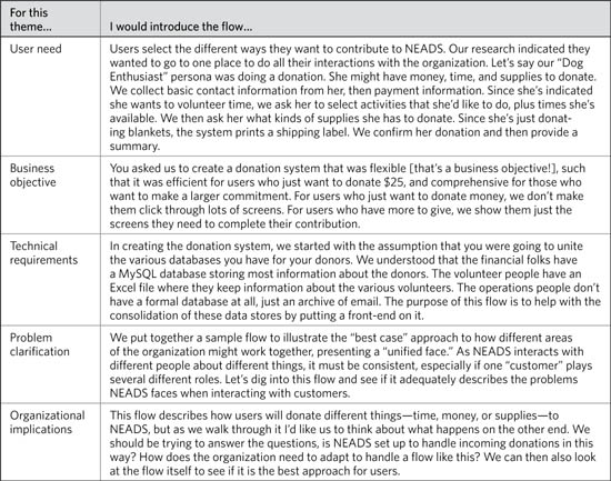
To set the context for a conversation about flowcharts, describe situations—the scenarios addressed in the flows and the users participating in them. In this part of the conversation, you also establish the overarching theme and the design problem you were trying to solve. Be able to start the meeting with a single sentence or two that says what the flow is about:
• The business objectives: By organizing your presentation around a set of business objectives, you describe how a flow supports particular goals. For example, if one of the goals of the web design project is to double new customer registrations, you can show how the flow has been designed with this objective in mind.
• The user need: In conducting user research, you may have identified broad needs from the users, like “make it easy to move from one function to the next” or “I need to share my information across different accounts.” Whatever the need, you can show how the flow supports this. As with a business objective, making a user need the central theme of your presentation means you do not have to dig into every detail of the flow, but can instead simply point out the elements of the flow that support that need.
• Technical requirements: Far be it from me to advocate designing a system around technical requirements, but this message may be important to your stakeholders. In these cases, there is usually some overwhelming technical consideration that directly impacts the flow. Your theme might be something like, “The legacy system has a specific definition for a user account, so we designed the new flow to accommodate that definition.” This isn’t to say that the technical requirements drove the design. Instead, you’re using the technical requirements to frame the conversation about the design.
• Problem clarification: Certain problems may seem intractable to clients or team members, and a flow can be an effective way to provide a solution or at least clarify the problem. For example, suppose your client says, “We have lots of disparate systems that all do the same kind of thing. Can we consolidate them?” Flowcharts can be a useful tool for documenting each system, or documenting what the systems have in common, and then structuring the conversation to determine an answer to the question.
• Organizational implications: Every online flow has some impact on the organization. As a new channel for sales, the flow impacts fulfillment and customer service. As a supplement to an internal business process—records management, for example—the online flow changes how people do business. You can use this impact as a central theme for educating people on the client side about how their jobs will be changing.
Figure 6.36. Donation flow, refer to this figure when reading Table 6.8.
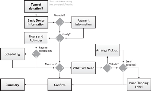
Table 6.8. Different themes position the same flow in different ways, but still emphasize the same key points.
2. Describe visual conventions
Before diving into the details, make sure people know how to read a flowchart. I like emphasizing starting and ending points, and showing any visual techniques I might have used to highlight the main process.
If you’ve layered on additional information beyond steps, paths, and decision points, be sure to point out how you’ve captured this information—the icons and styles you might have used.
3. Highlight major design decisions
Describe the flow’s main characteristics, including:
• Interaction model: Point out some of the distinguishing attributes of the interaction you used. Is this exclusive or inclusive? Is it a linear process with a few detours or is it highly branching? Is this a framework that allows for multiple functions? Is this a hub-and-spoke model or something more complex?
• High-level process: If you’ve chunked the steps into groups, used swimlanes, or identified a handful of steps as the primary path, these devices can help you describe the flow at a high level.
4. Offer rationale and identify constraints
Besides tying the design choices you made to the usual suspects (design principles, user research, industry standards, and so on), you can also reference any internal stakeholder interviews you conducted. This source is especially important if the flow depicts an internal process or a user experience for supporting an internal process.
5. Point out details
Unlike some other artifacts, where describing the details entails pointing out a handful of important examples that illustrate key points, you can walk through a flow from beginning to end. The simplest approach is to first follow the “happy path,” the primary pathway from beginning to end without any divergence:
• To start: Clarify the scenario before doing any walkthrough, to help participants understand the circumstances in which users might face the flow.
• For each step: Describe the key points of information presented on that screen. Focus on the information that is displayed in response to user action or is essential for users to perform the next action.
• For each decision point: Elaborate on the decision and who’s making it. Describe the criteria by which the decision is made.
• To conclude: Describe the disposition of the user at the end of the process—what has changed for them having gone through the flow. If any other artifacts have changed (for example, money has changed hands, databases have been updated, and so on), be sure to describe these changes-of-state as well.
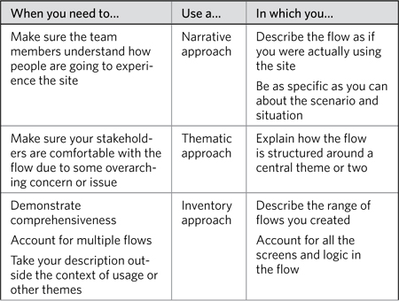
You can use other approaches for walking through a flow:
Table 6.9. Some approaches for walking through flows work better than others depending on the flow and the purpose of your meeting.
6. Communicate implications
Experience shows that the key metric stakeholders look at with flows is “How long will it take?” For better or worse, this is typically measured in clicks or number of screens. Most research shows that, in practice, users aren’t as concerned with number of clicks as they are with confidence: They want to have confidence that they are getting to their objective.
So, for this portion of the conversation, besides the usual discussion of technical constraints and design challenges, you can also elaborate on:
• Efficiency: Describe how the flow is efficient for users, minimizing steps or pages, prioritizing interactions by dependency or importance to the user.
• Additional requirements: In constructing the flow, you may have identified additional requirements for the design.
Like other artifacts, flows communicate a design that will likely impact the organization’s operations. Unlike other design decisions, however, the organizational impacts are pretty explicit in a flow. Use this portion of the conversation to hash out how the operations of the organization may need to evolve to support this new process.
7. Solicit feedback
When discussing a flow, I’m interested in these things:
• Is the logic right? Especially with complex flows, making the right decisions in the right order can be tricky. Putting decision points in the wrong order can yield unnecessarily complex flows, but they can also lead to flows that don’t make sense to users or are not easy to implement. Getting the logic right means ensuring that the dependencies between steps don’t lead to recursive pathways or dead ends. Since it’s in the abstract, you may have to facilitate the conversation, speculating about what happens if you were to move a decision point earlier or later, and let stakeholders react to the change.
• Are any steps missing? Stakeholders may identify a range of things that are missing. Despite design trends, most organizations still deploy web sites with complex interactions that burden users with having to supply way too much information.
• Is there a way to improve efficiency? Cutting down the steps of the flow (as described in “Communicating implications”) is a worthwhile objective. Use the flow to show how the project requirements demand a complex process. Suggest that expecting less commitment from users will yield better results. Take the opportunity to brainstorm about each step and decision point to identify ways to eliminate it or consolidate it with other steps.
8. Provide a framework for review
One of the things that make flows great is that they are meaningful to many disciplines on the project team. Take advantage of this multidisciplinary perspective when soliciting feedback:
• Technologists and developers: They have a strong logical bent and will have an intimate understanding of the underlying infrastructure. Ask them to identify any risks with how the process is structured or what the current technology platform will not successfully support.
• Business stakeholders: The best way to frame homework for the business stakeholders on your project team is to compare the flow to requirements. Business stakeholders heavily involved with the project will have an intimate understanding of the requirements. They can provide insight as to whether the flow misses any requirements or doesn’t adequately address them.
Avoid Newbie Mistakes
There are two main obstacles to a flowchart meeting that could derail it. Your participants may struggle to picture the user experience because the flowchart is very abstract. The quality of feedback depends on participants’ ability to envision the process, and if they can’t do that, your meeting could end up being a waste of time. When they can envision the process, however, they may get lots of ideas you hadn’t yet considered. You need to think on your feet to react to, accommodate, and potentially discourage ideas that fall outside of scope.
Make the abstract concrete
As concrete as the ideas in your flowchart may be, the document itself is an abstraction. Your meeting participants may not be able to offer constructive feedback because they can’t picture the user experience. Knowing whether this is a risk or not depends on how well you know your clients. If you and your clients can comfortably have back-of-the-envelope kinds of brainstorming sessions, they may be prepared to deal with the abstraction of flowcharts.
If you don’t know your client well enough to know whether the flows will be meaningless to them, it will become painfully obvious in the meeting. They might complain that they want to see screen designs or that they can’t picture it. Worse yet, they might sit there, nodding and smiling as if they understand everything about the flow.
• Build the flows together: If you’re quick on your feet, you can change your approach in the meeting, presenting the ideas in a different way. For example, it might be best to put the documents aside and build the flows progressively on a whiteboard. This way, the client can focus on one thing at a time, and ask questions along the way without the distraction of the documentation.
• Shift focus: On the other hand, you may realize that the clients’ attitude suggests that you won’t get anywhere in the current meeting. In that case, there’s no harm in changing the focus of the meeting. There’s no point in belaboring a document if it’s not getting you or the project team what you need. Remove the document from the focus of the conversation and shift to a dialog or interview. Use the flow to remind yourself of the remaining questions or the key themes and design decisions. For the sample flow, you might extract these questions and design decisions:
Table 6.10. Is the diagram distracting people in the meeting? Consider putting it aside and either asking some clarifying questions or describing some of the key design decisions you made.
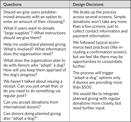
• Know for next time: Knowing the disposition of your client may lead you to skip sharing the flows with them altogether—not a bad strategy if doing so would waste everyone’s time. But, better to know this going into the project. Carve some time out at early meetings to share some sample diagrams, things you’ve done in the past that might sensitize your client to what they should expect to see. At this stage, before you’ve invested any time in developing deliverables for the project, you can assess what’s going to be most effective.
Stay flexible
Like many other design documents, flowcharts can open your team’s eyes. Their exposure to the user experience, even in abstract form, can trigger ideas that did not occur to them earlier in the project process. Even though user flows are not very concrete, they may be more tangible and closer to the final product than anything that came before.
Imagine taking some of these sample flows into a meeting with the stakeholders at NEADS, the nonprofit organization soliciting donations online to support their assistance dog program. At the table are people from communications, from business development, from the volunteer coordinators, from the dog training group, and several others. Walk them through the flows, and the ideas are bound to fly.
“Let’s do an iPhone app for donors, so they can get updates on the dog’s training process.”
It wasn’t something that came up during the requirements process, but it’s something you need to accommodate.
“Let’s let donors who sponsor an individual dog compete to see whose dog completes the training with a higher score.”
That was the business development guy. You wonder if the people in the dog training program appreciate putting a competitive spin on training. Still, perhaps introducing aspects of game design into the donor program could yield some interesting results.
Eyebrows raise. And we need to get back on track…
These situations can be difficult because clients may not recognize why throwing new requirements into the mix at this stage can be risky. It can be difficult to see that a single new requirement can have a cascading effect, impacting other requirements and design efforts. In these cases, drawing the new requirements right on the flow can help demonstrate the associated risks. Of course, such an approach could backfire: proving that even the craziest ideas are feasible on some level.
Using and Applying Flowcharts
As just one of a series of possible deliverables, flowcharts should draw connections to other milestones in your project plan. They can reference work that came before. They can set you up for work that’s to come. Here are just a few ideas of how flowcharts can be nestled comfortably inside the larger project structure.
Flowcharts for Planning
Planning a project requires understanding the big picture—the project’s final destination and how your tasks and outputs contribute to it. A flow at the right level of abstraction (not too detailed) can provide that big picture, and therefore a backdrop for effective planning.
Flows used for planning should:
• Avoid digging into too much detail on logic: To use a flowchart for project planning, you need to layer in additional kinds of information, like milestones, phases, project teams, even cost.
• Render the user experience to accommodate the project schedule: Even if the long-term vision is to put all the donation options on a single page, showing this won’t help envision the project plan.
Figure 6.37. Yet another means for marking up steps, this time with mile-markers indicating in which phase the team will address the design. Implicit in this approach, perhaps, is a hierarchy of importance driven by engineering resources, budget, or something else.
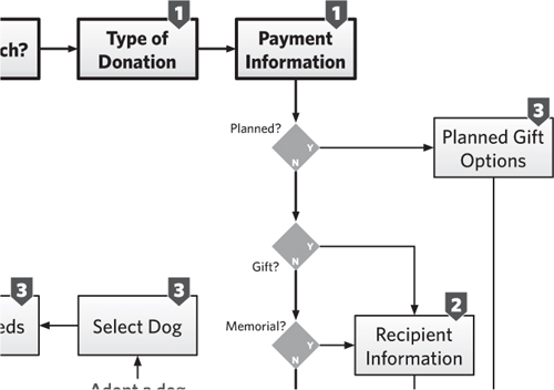
Flowcharts and Wireframes
Earlier in this chapter, flows were elaborated to include screen designs. Called “wireflows,” this approach combined the best of both deliverables. The flow describing interactivity and showing context united with the wireframes or screen designs to show the structure and purpose of each page.
Examples earlier in the chapter showed the boxes in flows replaced whole-hog with wireframes, screen designs, or thumbnails. But your wireflows could lean toward the other extreme as well, downplaying aspects of the flow and focusing more on the transitions between screens.
With less emphasis on the flow, the diagram looks more like a storyboard. The logic and multiple branches recede. The story is less about the overall picture and more about what users see in a particular circumstance, or in a particular transition. For the heck of it, let’s see what a diagram with a more even distribution between “wire” and “flow” looks like.
With an even emphasis between the screen design and the flowchart, the diagram shows some branching with associated application logic, but it doesn’t try to be comprehensive. It shows less detail on the screens, either by reducing the fidelity or shrinking the size of the screen. Both approaches sacrifice legibility in favor of showing more “flow.”
Figure 6.38. Shifting the emphasis more to the screen designs means not necessarily increasing their fidelity or detail. Instead, in this case, it means stripping out some of the application logic and secondary pathways of the flow.

Figure 6.39. Some logic preserved. In this case, what happens when users provide a donation greater than $500. Still, some detail is missing from original flow, and we haven’t completely subsumed the diagram with details about the screen contents.
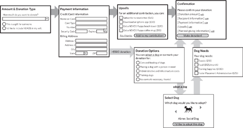
Flowcharts and Personas
One of the third-layer elements of flowcharts is user motivation. It can be useful to highlight what drives users to participate in the flow. You can “amp up” the presence of the user’s thought process in your flow by combining it with personas.
This hybrid can ground your flows by articulating the relationship between the experience and the users. I call this technique “wireflow comics” because “wireflow graphic novels” was just too ambitious. In this case, persona avatars appear adjacent to each screen with a thought balloon expressing the user’s reaction to the screen. These reactions can be:
• Impressions: A description, in the user’s voice, of what they think they need to do on this screen based on its contents.
• Expectations: A description, in the user’s voice, of what they think they need to do on the screen. This can be especially useful if the flow is meant to support an existing, well-entrenched business process.
Of course, this approach is very powerful if you use quotes from actual users. With that kind of data, you have an opportunity to demonstrate how the design addresses requirements, straight from the horse’s mouth.
Figure 6.40. Combine a wireflow with personas and your design comes to life. Use the personas to flesh out the explanation of the experience. Or, as in this case, the personas can provide a commentary on what they’re “seeing.” In this way, this approach acts as a design tool, helping you think through all the nuances and details for the design. (Illustrations by ISD Group, available on DesignComics.org)

Tip: DesignComics.org
I got the artwork for the persona from designcomics.org, a site developed by Martin Hardee. Besides people, the site includes free illustrations to create all kinds of comics for the purpose of design.
The Depth of Process
In the early days of the web, sites were just repositories of information, where the structure of navigation was paramount. As the web evolves, permitting different types of interactions, designers and developers will need a means for planning and documenting these complex user experiences. Flowcharts will become increasingly important as web sites become more interactive.
But there’s another aspect of the flowchart that makes it important to the design process. Internet technologies are playing an increasingly strategic role in business, becoming an essential plank in the customer communications and internal business operations platforms. Process documentation is crucial because the web changes the nature of interactions with customers and between colleagues. The flowchart allows us to get our heads around not just how people interact with the web site, but operations as a whole.
This isn’t anything new—management consultants have been using flowcharts for decades to describe the internal operations of an organization. But with the web comes an unprecedented level of interaction between people and technology. The web does more than allow us to conduct business differently, it has changed the face of what business is. As work becomes increasingly focused on information, the kinds of interactions organizations have with their customers and the kinds of collaboration that take place between workers change dramatically. Workers are no longer cogs in a machine with specific tasks to accomplish, and customers are no longer held at arm’s length with minimal impact on the organization and the work.
The web, as a business tool, forces us to think about how information moves in and out of the organization. The flowchart illustrates this experience.
The web, as a catalyst for change, forces us to rethink the roles of workers and customers, and their contributions to conducting business. In this case, the flowchart needs to operate at a higher level, showing how organizations must take advantage of and participate in these kinds of interactions. To accommodate this change, our notion of a flowchart must also change. Flow and process will never go away, but our assumption that flows are linear and made of discrete steps must change to recognize the evolution of business.
Moving to application design
Simple flows will remain useful for years to come. And by simple I mean diagrams conveying self-contained processes with a small number of steps and allowing users to accomplish single, discrete tasks. Even web sites that more closely resemble desktop applications will require such simple flows for a variety of tasks—authenticating users and setting preferences come to mind.
Web sites resembling desktop applications are becoming more prevalent. Some would argue that “desktop applications” are increasingly a thing of the past. Just as activities like banking and shopping and travel planning have moved online, so too are tasks related to word processing, spreadsheets, and countless business processes. This transition offers expansive opportunities for user experience designers: These applications can be highly interactive while networked, and blindingly responsive while being updated invisibly. Designers’ tools must keep up. Can flows evolve to reflect the power now possible in online applications?
Flows will endure, because they are inherently flexible. They can be as abstract or as concrete as you need. They can be as rough or as formal as necessary. They can be produced in the space of an hour, and they’re easy enough to understand to precipitate all kinds of useful conversations.
We will need to discover new formats that allow designers to communicate platforms—online ecosystems that support dozens or hundreds of tasks, like desktop applications today. These platforms also allow users to accomplish the same objective in numerous ways; for example, an online banking application accommodates severals ways of balancing a checkbook or different approaches for researching a home loan. And so flows won’t show how users get from Point A to Point B, but instead how an informational ecosystem responds to a range of actions.
And yet organizations like NEADS will continue to use the web to collect donations. As much as these transactions can be commoditized, every organization has its own nuances, operational hiccups, and crazy marketing concepts. Putting these down on paper with rectangles, diamonds, and arrows will likely be the best way to communicate and elaborate on these ideas for years to come.
Exercises
Practicing flowcharts involves two things: learning about the details of a particular process and then translating that process to a user experience.
- Create a flowchart for your morning routine, up through leaving your house. Incorporate the decisions you make about various inputs (like the day of the week or the weather).
- Interview a friend or colleague about their work or hobbies. Identify a task and create a flow for a new application to support that task.
- Transform the exclusive flow in Figure 6.28 into a wire-flow, combining elements of the flowchart with actual screen designs. Decide how much of each screen you want to show. Decide how you want to lay out the flow and communicate logic with something less explicit than decision points.
- Create a flow describing the experience for signing up to get an assistance dog. NEADS’ current web site (www.neads.org) is pretty explicit about how the process works. Use your imagination to think of how they can use the web site to support this process. Your flowchart should use swimlanes to show the interaction between the customer (the person with the disability), the web site, and the organization.


